When Wieden + Kennedy Tokyo released Type at the start of the year it got a lot of buzz from both eyewear lovers and typeface fans. Japanese typology design is respected around the world and its eyewear brands are very innovative, as we frequently report on this blog.
What Type did that was so awesome was take the Garamond and Helvetica fonts and actually use them as the design motif.
The resulting eyewear range integrated the look of the actual fonts into the design of the spectacles themselves.
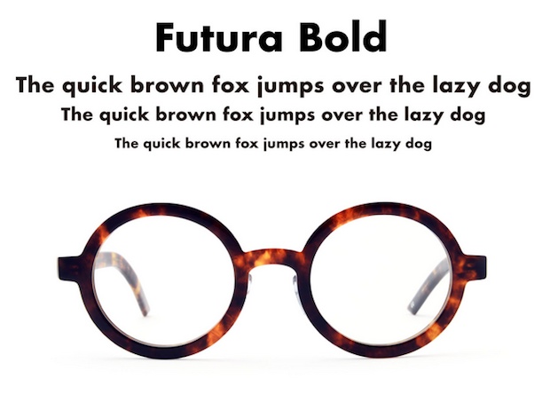
There were three weights — light, regular or bold — and three colors (clear, black or tortoise).
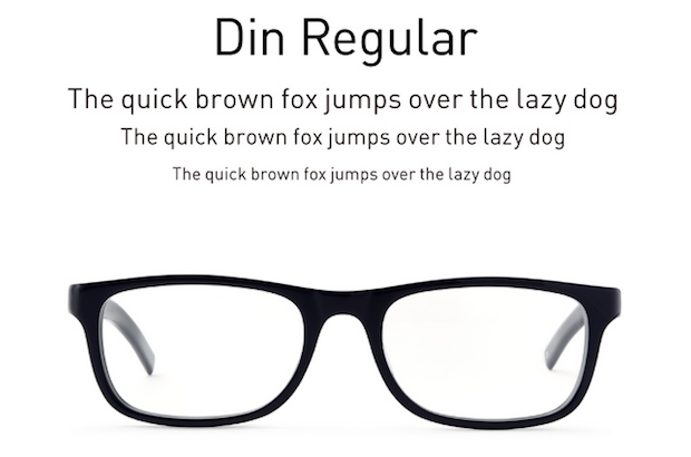
Now they have launched two more lines based on a pair of new fonts — Din and Futura.
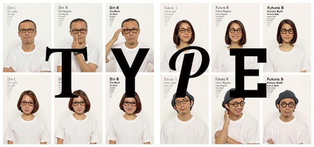
The name, Type, is a play on its meaning as “font” but also as in “character”, that is, you are the kind of glasses you wear.
The concept says:
You are a character. You have a voice and a style. You’re straight or you’re odd. You’re classic or complicated or light or clunky or simple. And you are what you are and that’s good. Because that makes your type the type we like.
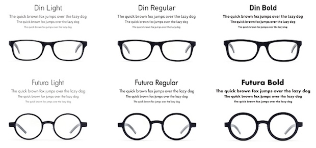
Din is a German font from the 1930’s (the name stands for Deutsches Institut für Normung) and can be found on manhole covers in Germany. It is a polished, neutral design that lends itself to a variety of utilities. Futura, on the other hand, featured on German Deutschmark bank notes. The modern-looking font is rounder and is a common sight in brand logos.
Like the previous line-up, the new Type font eyewear is available from Oh My Glasses and also Shibuya Loft.

