When governor Yuriko Koike came to power she quickly set about making sweeping changes from her predecessor’s administration.
She put the controversial move of Tsukiji Market to Toyosu on ice. She also pulled the plug on the expensive &Tokyo branding campaign, despite the fact that it had cost the city ¥130 million.
While you can still see the logo here and there, officially it is going to be replaced by a new logo to be displayed in airports and used for government publicity materials to promote the city.
Three candidates for the new logo have now been announced by the Tokyo metropolitan government. And boy, are they duds.
From the cringe-worthy concepts to painful fonts and ugly colors, these logos look like they were designed by high school students less than an hour before school finished on a Friday. If these are the “best” three, what was the dross that got rejected like?
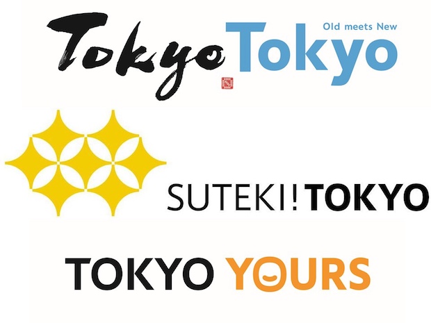
Rule number one: if you’re going to use English or a foreign language in your logo or catchphrase, get it right.
Let’s start with Exhibit A: Tokyo Yours. No, “Your Tokyo” makes sense.
Next up, Suteki! Tokyo. We have nothing to say about this except that it’s ridiculous. No one knows what “suteki” (lovely) means (just as no one knows what “omotenashi” means, so please stop using it). Considering that Governor Koike asked for a new logo because she felt that &Tokyo was hard to understand, it beggars belief that they are even considering this design. And that exclamation mark? What’s that all about?
And finally, Tokyo Tokyo Old Meets New. No, there is almost no “old” left in Tokyo because everything keeps getting knocked down and replaced by glass towers. “New and Newer” would be more accurate. Any ad agency wonk who thought this one up has clearly never been to a European city.
Tokyo, please: you are an amazing city. Don’t embarrass yourself by choosing one of these three candidates.
















3 Comments
Care to explain why the fonts are “ugly”?
Tokyo Yours is a clever copywriting game between yours and tours. Sad you missed it. Really sad.
@Seregios
Maybe it is meant to be a pun but to us “Tokyo Tours” still doesn’t make much sense: this is advertising the Tokyo brand to the outside world, not promoting tours of the city. Tokyo Tours sounds more like a travel company. We’re not design experts by any means but everyone we have spoken to so far dislikes these logos. Even if you don’t mind them, aren’t you surprised that these were judged to be the best three? Of course, we welcome a range of opinions. This was just our take.
@Japan Trens
Hi, thank you for the replay.
As an art director working daily on this field I still don’t understand your point. :)
Let me explain how brand identity works:
when you develop an identity (this is one may be considered Landing Branding) you have to do mostly 4 things (and others that I won’t elencate, not lesser important but the focus usually is not this ones):
-Understand who is your target (and then the “target group” ignore this and you will fail)
-Do a lot (a lot) of research.
-Keep it simple, every one has to understand it.
-Keep it international, with a spark of National.
Who is the target? The entire world.
What about the tg? Foreigners who use tour operator and visit mostly Tokyo with this solution. They are aiming for that: tourist. Just seek for the brief and you will see.
The data from research requires a very large amount of case study, declined in weeks of hard work.
Tokyo Yours, Tours: kinda simple and memorable. I think this one could be the answer.
I’ve asked and 9 people out 10 understand it on the fly. I would say it works. Kinda surprised me you didn’t got it. :)
Again the copywriting game between your and tours recalled a little to me the kanji system of Japanese language. Maybe a western can’t get it, but the Japanese people can. And they know.
So of this ones to me is the most acceptable. Everyone can read it, write it, there is a nice creative writing inside, slightly recalls their grammar and address the tourist on take a tour around the city.
You don’t always need a logo. Sometimes typography will do the job. After all, Japan Trends uses Typography.
Moving forward
What about the fonts? Why to you look “horrible”? You didn’t explain.
The sans-serif used in “Tokyo Yours” recalls the old one City Branding and works good with contrast and legibility.