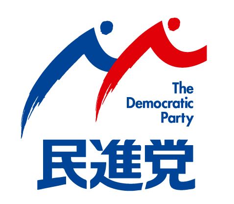
On May 19th, Katsuya Okada unveiled the new logo of the newly formed political party, the Minshinto.
The Democratic Party, as it is called in English, was formed out of the merger of two other opposition parties from different sides of the center: Democratic Party of Japan, or Minshuto (who held power from 2009 to 2012), and the Japan Innovation Party, or Isshin no To.
The unusual merger has met with a muted response and has yet to give the opposition any perceivable boost in ratings or energy.
Okada boasted that the new logo, created by Hirokazu Mitamura, is “future-looking” and full of “vibrancy”.
Perhaps this will do the trick when it comes combatting to public apathy about the party? Not quite, it seems. People have rather been quick to point out possible plagiarism.
In the logo — chosen from 3,676 online submissions — there are two figures, perhaps representing the new-found unity of the parties, bending to form an M-like shape (hinting at the party name in Japanese).
However, recalling last year’s 2020 Olympics logo debacle, some have pointed out that the logo is strikingly similar to the logo for Imuraya, a Mie-based food manufacturer.
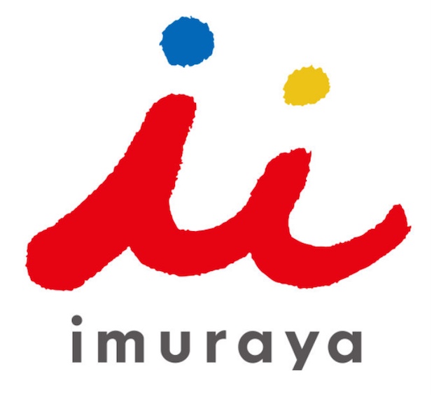
The party, though, claim to have already been aware of this accidental plagiarism issue and Okada personally checked with the company to secure their permission.
But the carping at the back doesn’t stop there. Others have also noted that the two figures have an unfortunately erotic undertone: is the red figure not “groping” the blue one?


